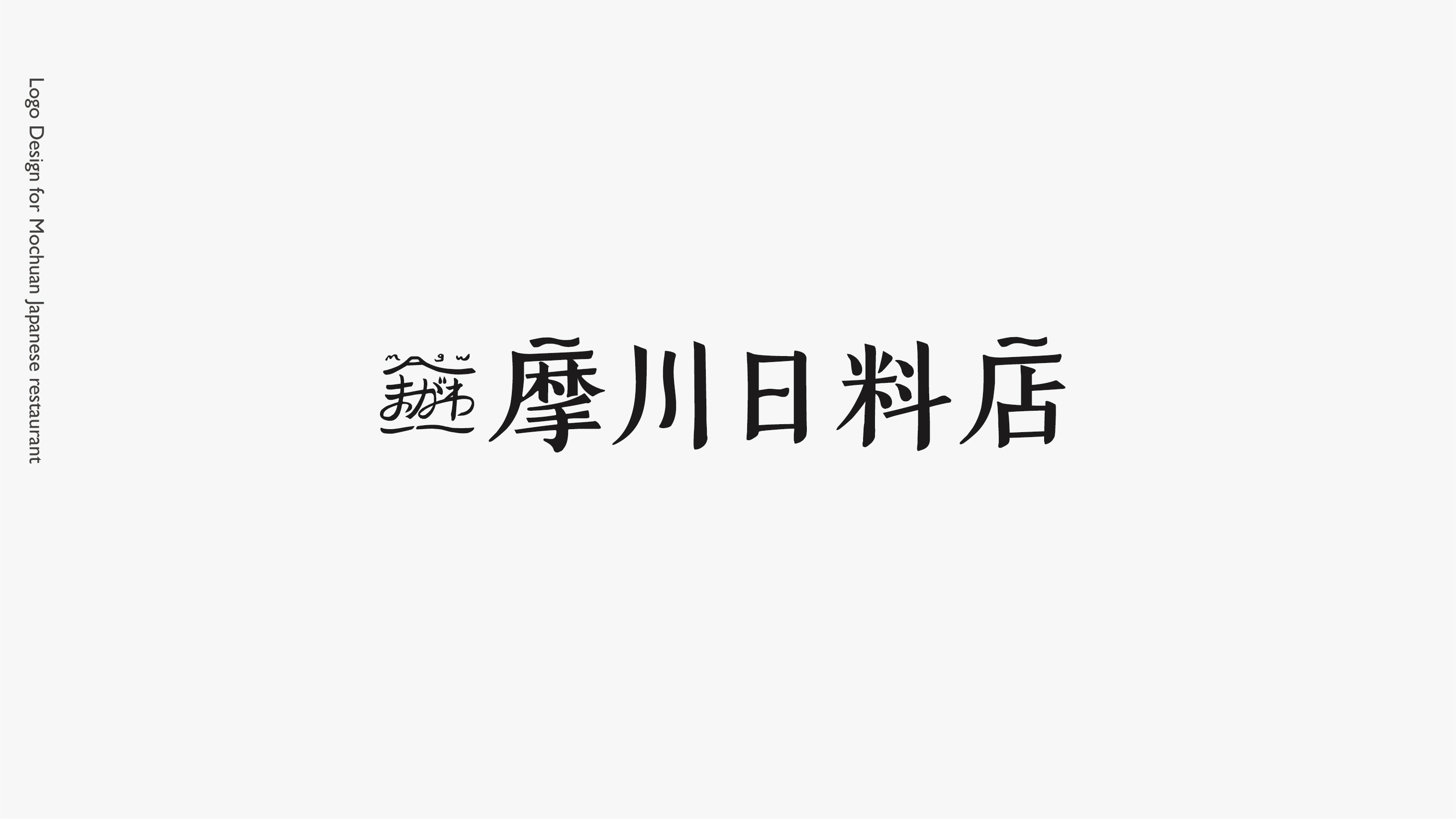


摩川日料店
Japanese restaurant
logo design
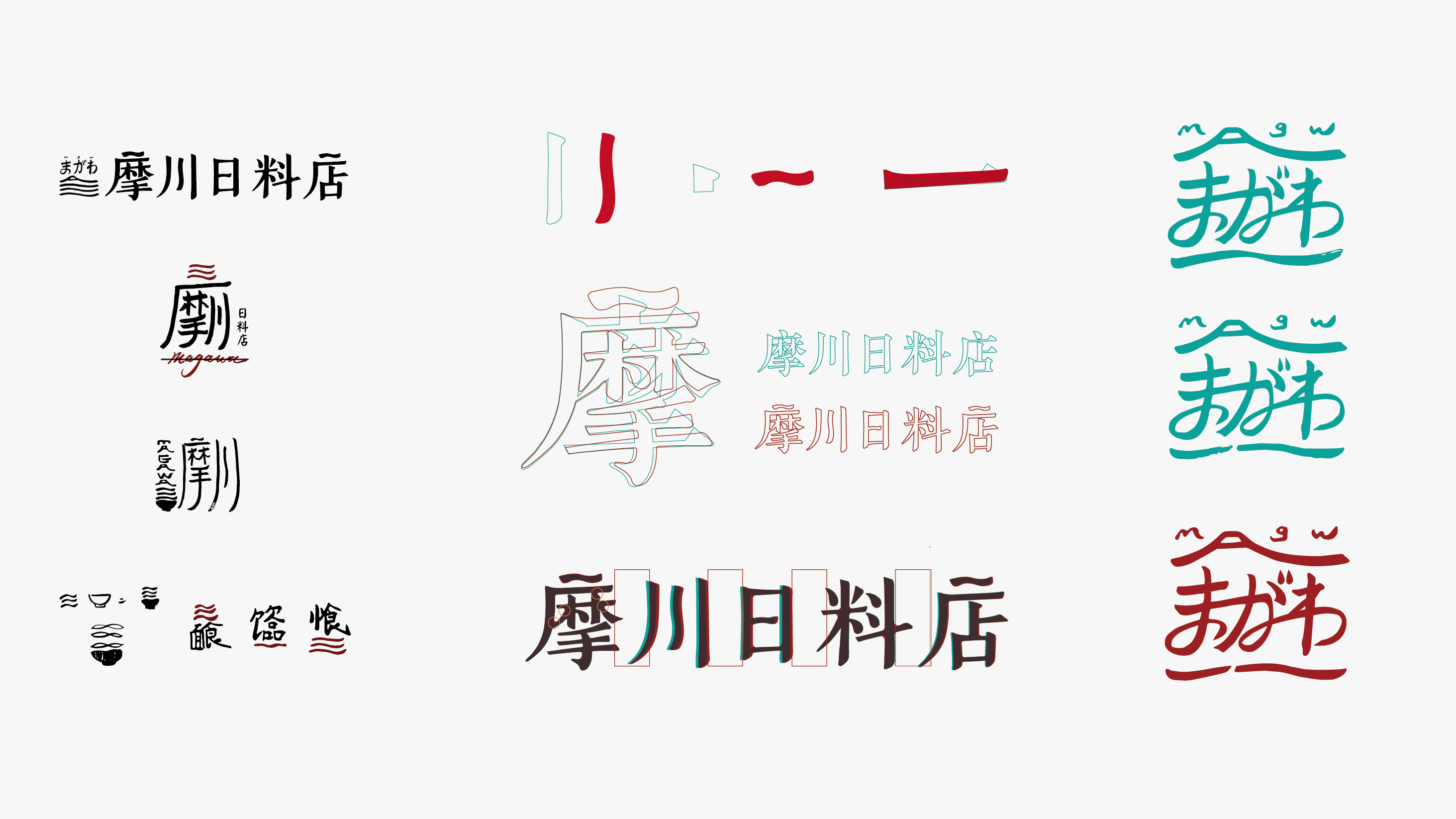
Purpose
Commissioned by a Japanese shop owner. In the process, I went to Japan to find inspirations. In Japan, I felt that most Japanese stores were dominated by traditional characters, so decided to keep this feeling of my logo
Background
Early through a series of conversations and inquiries, I want the feeling of the brand as authentic / warm / enthusiasm. Therefore, the logo reflects the characteristics of mochuan's mother river, which combined with color selection.